

Wood furniture has a big influence on how a room feels, whether it's a pale oak or a deep walnut, both are timeless and elevate a space instantly. Choosing a colour palette that works in harmony with either, however, isn't always as straightforward as it might appear. A shade that looks perfect on a swatch can behave very differently once it is on the wall and sharing the space with your furniture.
This guide is designed to help make those decisions feel a little simpler. Rather than setting the rules, we'll explore colours that tend to work alongside both light and dark wood furniture and explain why it feels balanced. The aim is to help you make choices that feel natural and right for your home, rather than forced or over thought.
Colour Matching 101: Pairing Paint to Wood Undertones

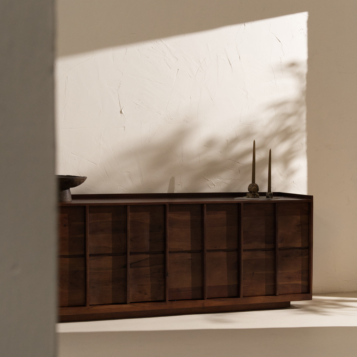
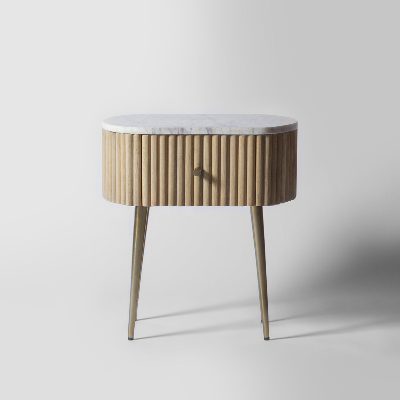
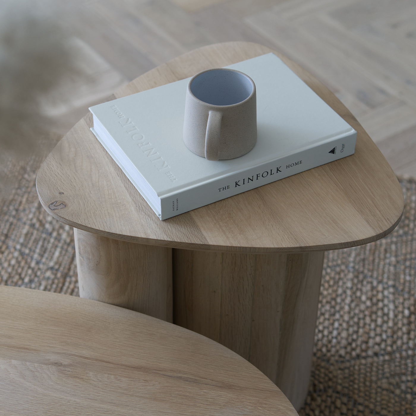
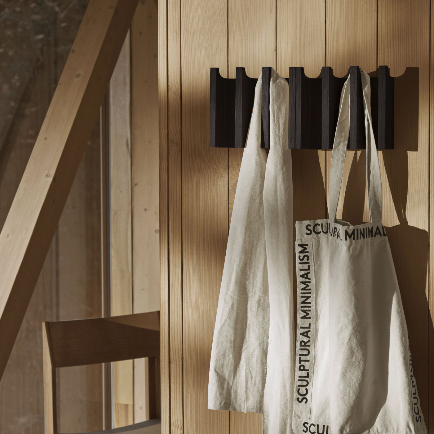
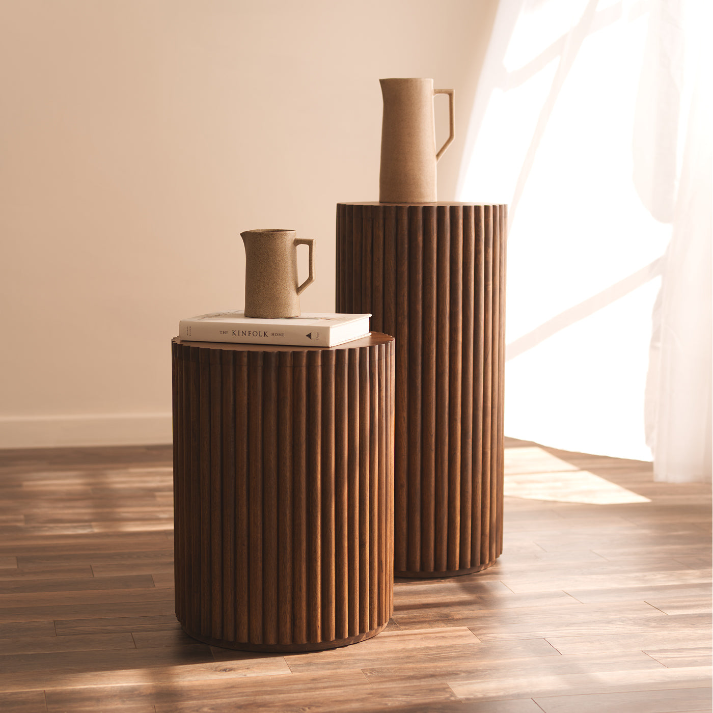
Both light and dark wood carry undertones that influence how colours sit around them. Lighter woods such as oak and pine often have warm, slightly golden notes, while darker woods such as walnut or mahogany tend to feel richer and deeper, often with red or brown undertones. These underlying tones affect how surrounding colours are perceived. When a wall colour shares a similar warmth, the space feels more balanced and cohesive. When it doesn't, however, the contrast can make a room feel unsettled.
A simple way to identify a wood's undertone is to assess it in natural light and determine if it reads more yellow, red, neutral etc. Once you're aware of them and know what you are looking for then it makes it easier to narrow down colours that will complement your furniture rather than work against it. This doesn't mean that everything needs to match perfectly however, instead, aim for colours that acknowledge the warmth already present in the undertone of the wood. Even cooler shades can work when softened or slightly muted.
Paying attention to undertones early on creates a foundation that informs the rest of your colour choices, making the process feel more intuitive and less forced.
Common Colour Matching Mistakes and How to Fix Them

A common misstep is choosing colours in isolation, without considering how they interact with the furniture in the room. Some shades that feel warm on a sample can read cooler once placed next to golden oak or red-toned walnut. This can then create a subtle imbalance within a room, the same applies to neutrals. Cool greys or whites with blue or green undertones can sit uncomfortably alongside warm wood.
Light also plays an important role in how undertones are perceived. Natural daylight highlights the true warmth or coolness of both wood and paint, while artificial lighting can soften or alter those tones, particularly in the evening when natural light isn't available. A colour that feels balanced during the day may shift once artificial light is introduced which in turn changes how it sits alongside your furniture. Taking the time to asses samples in both conditions will help ensure a space feels comfortable and balanced at all hours of the day. Warm neutrals often become the most reassuring choice, creating a calm and adaptable backdrop that works effectively with both light and dark wood as the light changes throughout the day.
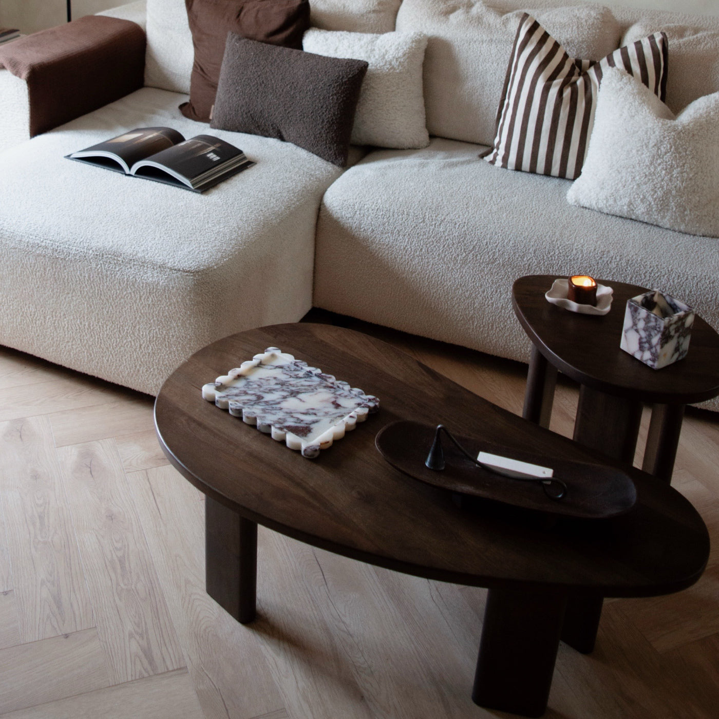
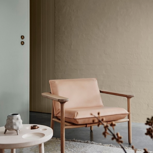
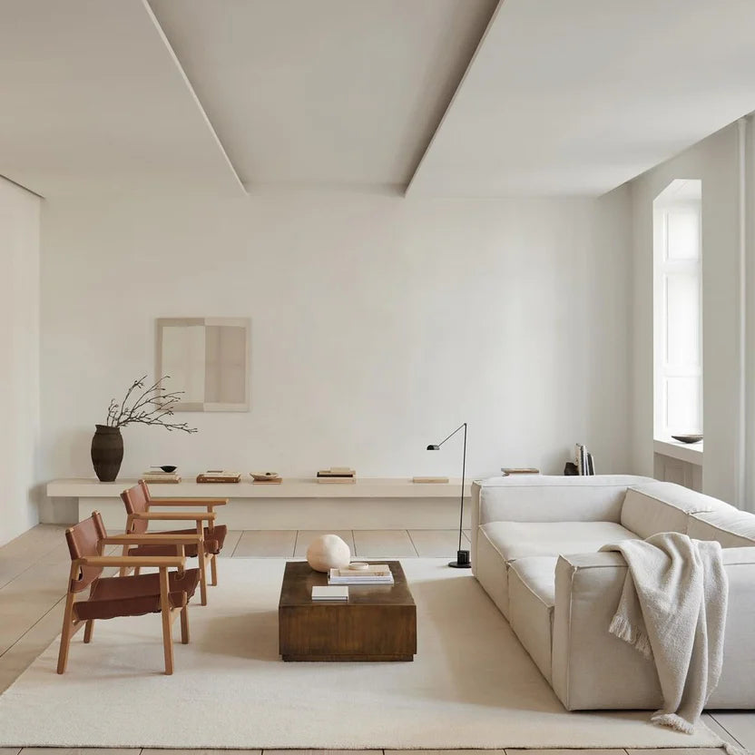
Colours That Work With Light & Dark Furniture

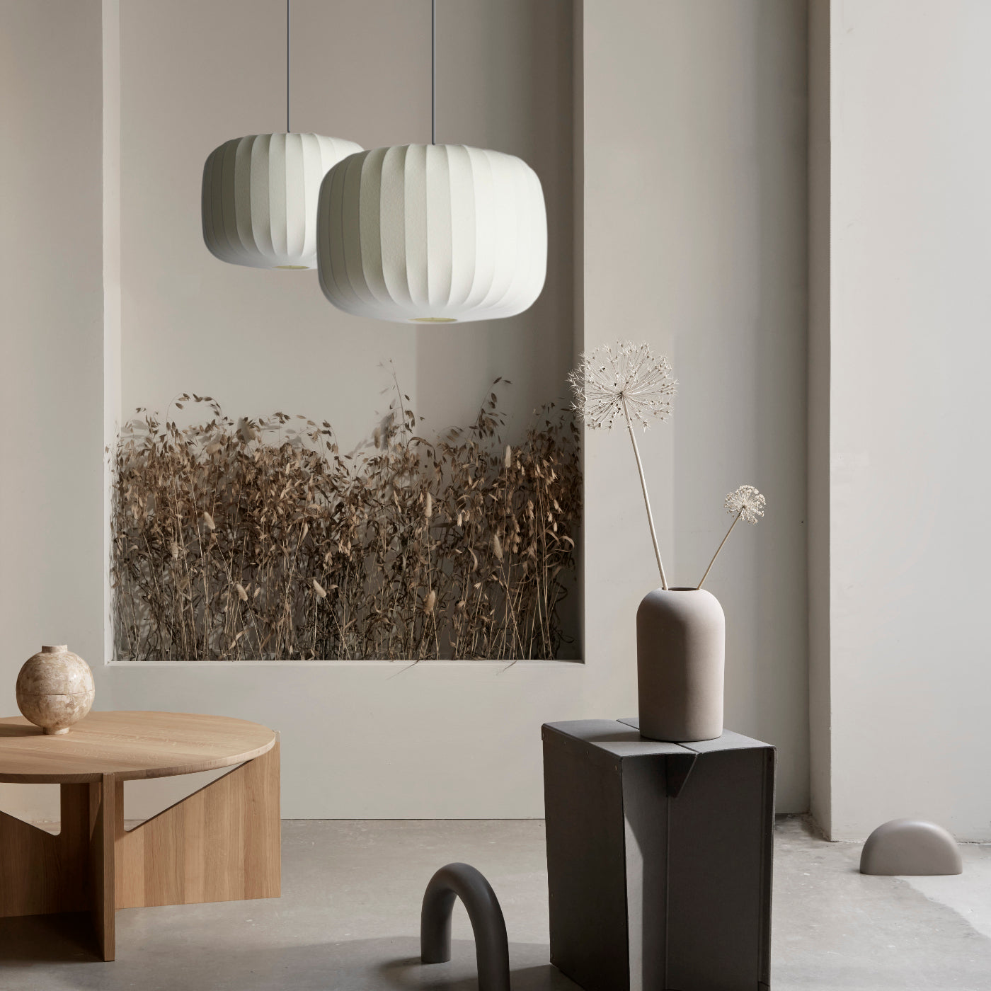
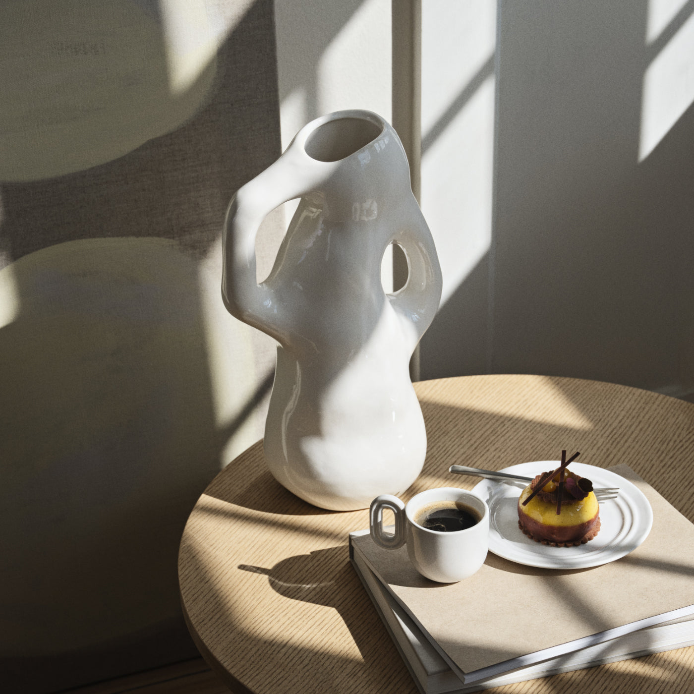
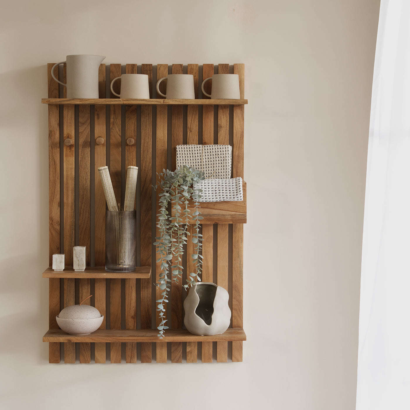
Warm neutrals are often the easiest and the most reliable choice when when working with either light or dark wood furniture. Shades with soft beige, stone or subtle taupe undertones echo the natural warmth of the wood, giving balance to a space rather than feeling stark or clinical. Unlike cooler neutrals they sit comfortably alongside a wide range of wood tones and allow the furniture to remain the focus of a room.
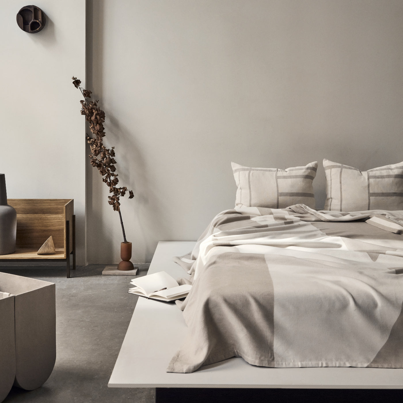
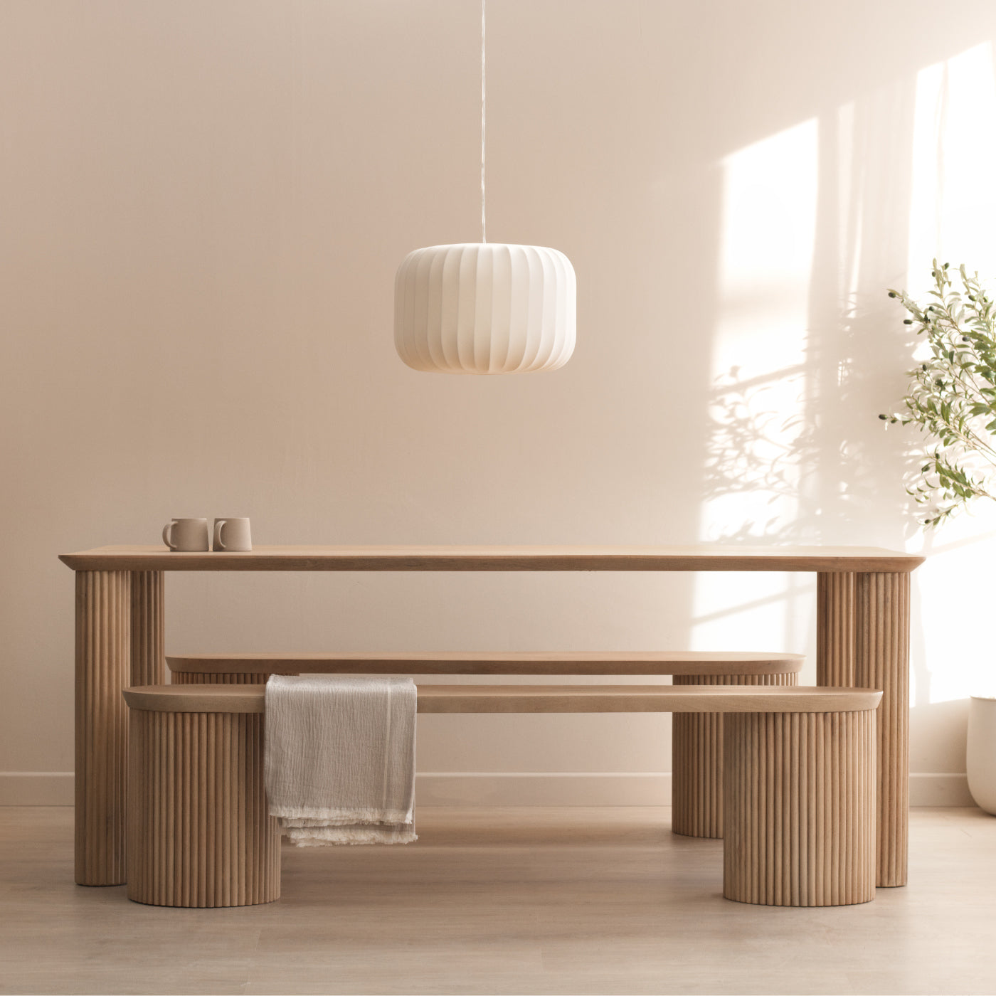
With lighter woods such as oak or pine, warm neutrals enhance the grain and texture while keeping a space feeling light and open. With darker woods, the same tones help to soften the richness of the furniture preventing a room from feeling too heavy. As warm neutrals can shift subtly as the light changes through the day, its worth observing them at different times before making a commitment. Once that foundation is in place it becomes much easier to identify which warm neutral shades work best with light wood and which are better suited to darker finishes.
The swatches below give an idea of what shades work best with light woods and ones that sit more comfortably alongside darker woods.
Warm Neutrals That Compliment Light Furniture
Alabaster (SW 7008)

Revere Pewter (HC-172)

Slipper Satin (No. 2004)

Producer: Farrow & Ball
As per Rabart:
"Slipper Satin is a delicate, off-white that creates a serene atmosphere by using subtle warm undertones to provide a soft, neutral backdrop."
Warm Neutrals That Compliment Dark Furniture
Dover White (SW 6385)

Producer: Sherwin-Williams
As per Wild Fox Painting:
“Dover White is a creamy, warm off-white that uses yellow and beige undertones to create an inviting atmosphere. It's subtle warmth harmonises with the rich tones of dark wood while keeping the overall space feeling light and bright”
White Dove (OC-17)

Producer: Benjamin Moore
As per Home&Garden:
“This makes it a great choice with dark wood furniture, because its gentle warmth softens the contrast without making the space feel heavy or too creamy. Instead of creating a harsh backdrop, White Dove allows the richness of woods like walnut or mahogany to stand out while keeping walls light and inviting.”
Accessible Beige (SW 7036)

Producer: Sherwin-Williams
As per Home&Garden:
“This colour pairs beautifully with dark wood furniture because its warmth helps soften the richness of deep finishes like walnut or mahogany. Rather than creating a stark contrast, it provides a gentle, balanced backdrop that makes the wood feel intentional in the space while still keeping walls warm and welcoming.”
Introducing Colour Without Overpowering the Space

If warm neutrals feel a little too safe, introducing colour on the walls is a great way to compliment the furniture without overwhelming. When wood pieces are already doing a lot of the visual work within a space, softer and more muted colours tend to sit more comfortably than anything too bold.They'll bring interest to the space they're in while still allowing the texture and tone of the wood to remain the focal point.
Muted, earthy tones are often the easiest place to start. Colours like softened greens, dusty blues and warm clay tones complement both light and dark wood. Choosing these types of shades helps the room feel layered and lived-in, adding colour in a way that feels balanced.
Choosing colours to work with either light or dark wood furniture doesn't ver need to feel complicated. Once you start paying attention to undertones, light and how colours behave throughout the day, the process becomes much more intuitive. Whether you lean towards the warm neutrals or prefer to inject a little colour, the end goal is always the same, to create a space where everything feels balanced.
Ultimately, the best colour choices are those that feel comfortable to live with and by taking the time to test shades, observe them in different lights and trust how they make a room feel, will always yield better more satisfying results.