


Autumn changes the atmosphere of a home almost overnight.
Natural light softens, evenings draw in earlier and the bright freshness of summer gives way to richer, earthier tones. It’s often the season that makes people want to reset their surroundings, introducing warmth, depth and a little more intimacy into the spaces they spend the most time in.
Creating an autumn-inspired interior isn’t simply about filling a room with burnt orange cushions and dark paint colours. The difference between a space that feels balanced and one that feels overworked usually comes down to proportion.
That’s where the 60-30-10 rule becomes useful.
The 60-30-10 Rule
This long-standing interior design principle breaks a colour scheme into three distinct parts:
- 60% dominant colour
- 30% secondary colour
- 10% accent colour

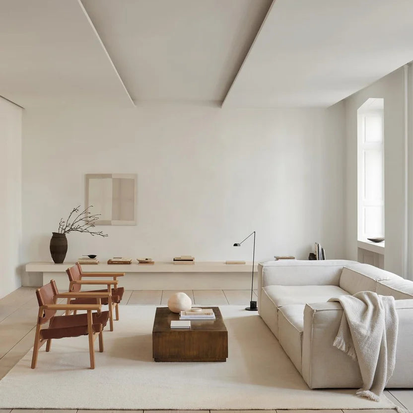
The dominant shade forms the backdrop of the room through walls, flooring and larger furniture pieces. The secondary colour introduces contrast and depth through sofas, curtains or rugs, while the final 10% acts as punctuation through smaller accessories and decorative details.
The framework itself is simple, but it creates enough structure to stop a room from feeling visually chaotic.
Building an Autumnal Palette
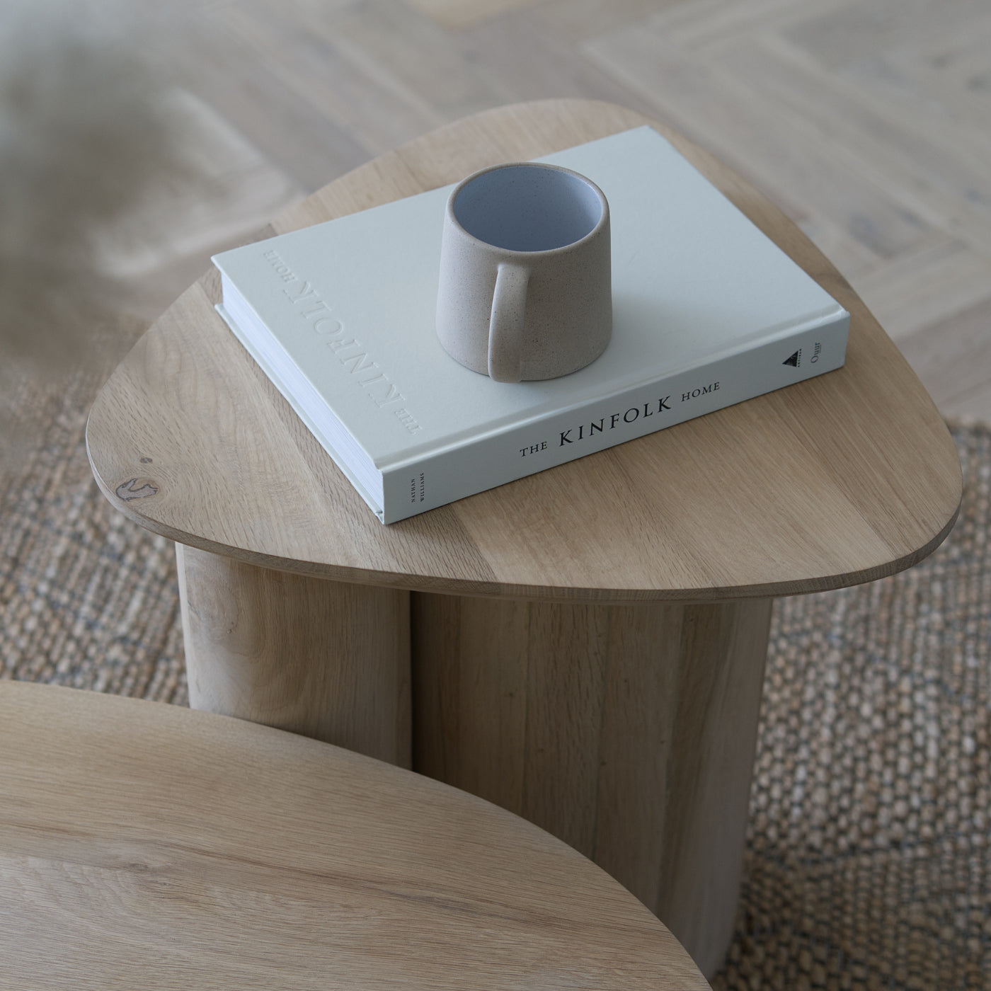
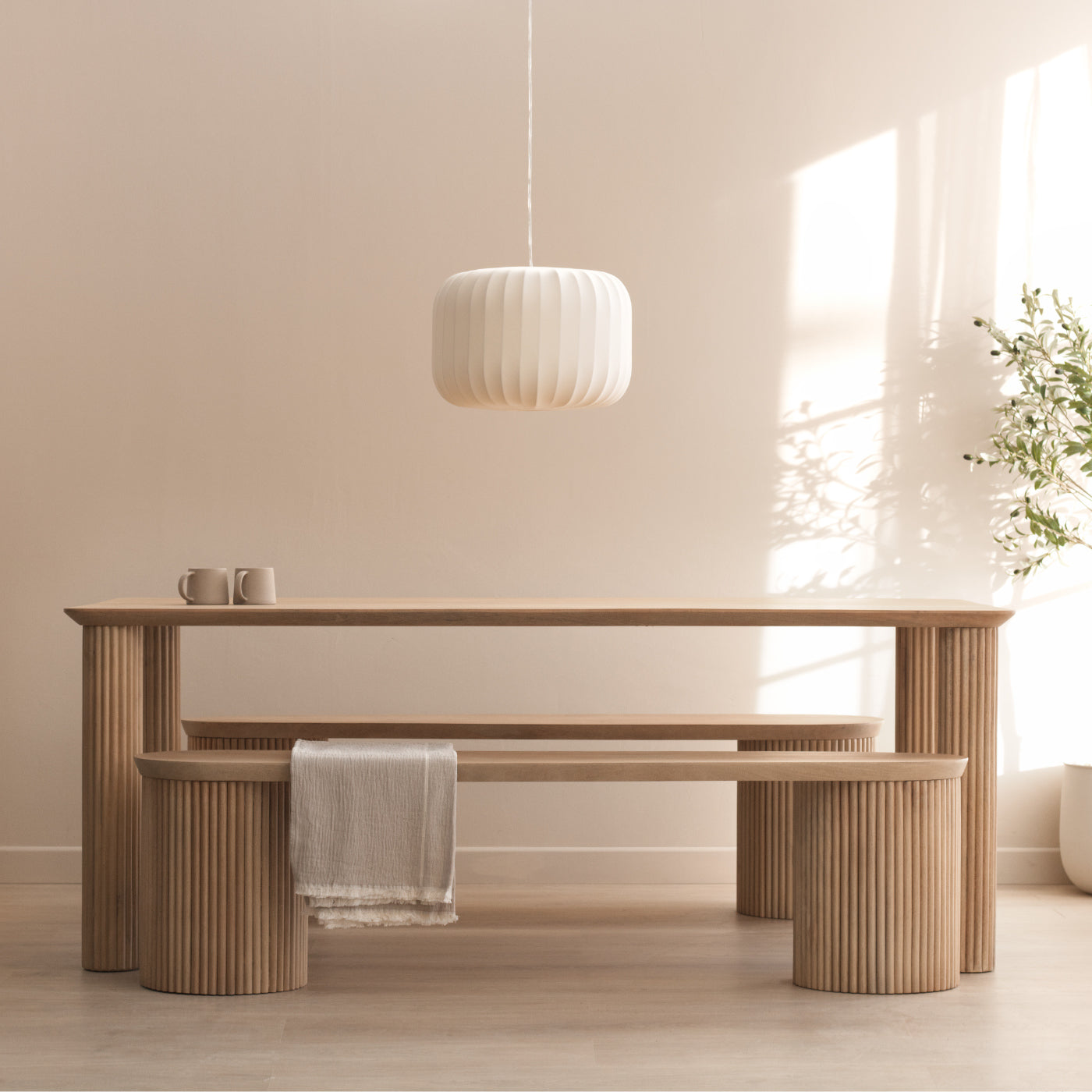
For autumn-inspired interiors, the strongest foundations tend to come from warmer neutrals rather than stark whites or cool greys.

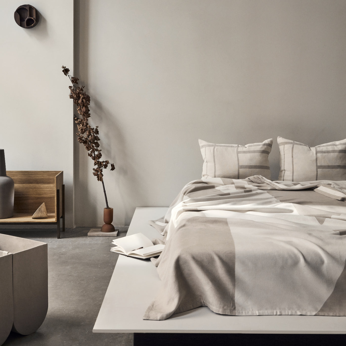
Soft beige, stone, chalky cream and muted off-whites create a backdrop that allows richer seasonal tones to sit naturally within the space. Shades such as Farrow & Ball’s Slipper Satin, School House White or Sherwin-Williams’ Accessible Beige all lend themselves particularly well to this approach.
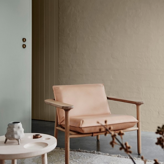
The secondary layer is where the palette begins to deepen. Forest green, terracotta, clay, aubergine and muted rust tones all echo the colours found outdoors during autumn, bringing weight and contrast into the room without dominating it.
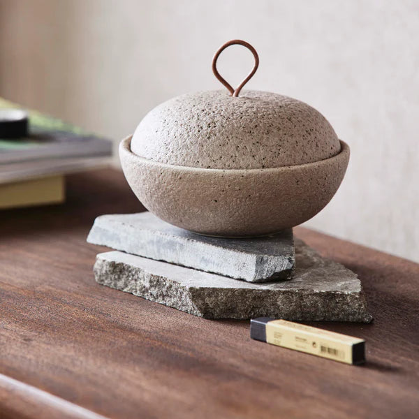
Accent colours then become the finishing layer. Mustard yellow, saffron, burnt orange or deep earthy reds work well through cushions, artwork, throws and smaller decorative pieces. Used sparingly, they help pull the entire palette together.
Autumnal Colour Combinations
One of the strengths of the 60-30-10 approach is how adaptable it becomes once you understand the balance.
A warm beige backdrop paired with deep forest green and touches of rusty red creates a grounded, nature-inspired palette. Softer creams combined with terracotta and muted saffron tones feel warmer and slightly Mediterranean. Meanwhile, deeper plum or aubergine shades layered against pale neutrals and mustard accents bring a richer, more dramatic atmosphere into a room.

The key is allowing the neutral base to carry most of the visual weight while the deeper colours add rhythm and variation.

60% (Walls) – Sherwin – Williams - Accessible Beige (SW7036).
30% (Sofa/Curtains) – Deep Forest Green (Pantone 19-0650 TCX)
10% (Pillows/Accessories) – Deep Rusty Red (Pantone 18-1442 TCX)

60% (Walls) – Farrow & Ball, Slipper Satin (No. 2004)
30% (Sofa/Curtains) – Rich Terracotta/Clay (Pantone 7594 C).
10% (Pillows/Accessories) – Intense Orange/Yellow (Pantone 15-0955 TCX)

60% (Walls) – Sherwin Williams, Shoji White (SW7042).
30% (Sofa/Curtains) – Deep Plum/Aubergine (Pantone 19-3316 TCX).
10% (Pillows/Accessories) – Mustard Yellow/Gold (Pantone 14-0848 TCX)
Best Autumnal Paints
Colour is only part of the equation. Higher quality paints tend to contain richer pigments, which create greater depth and subtle tonal variation once applied to walls. Brands such as Farrow & Ball, Little Greene, Paint & Paper Library, Edward Bulmer and Mylands are often favoured for precisely this reason. The colours feel fuller, softer and more nuanced depending on the light throughout the day.


Autumn interiors work best when they feel layered rather than themed.
The goal isn’t to recreate a seasonal display. It’s to create a home that feels warmer, richer and more inviting as the light changes outside. By grounding the room in softer neutrals and introducing colour with restraint, the entire space begins to feel more cohesive and comfortable during the colder months ahead.